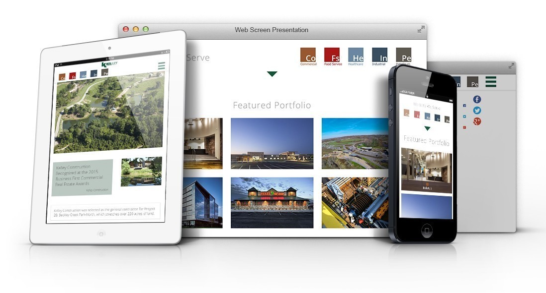
Mobilizing their online image.
We built Kelley Construction’s prior website, and it performed well for several years. However, in the intervening years, they completed a ton of successful projects — too many to work well with their old layout. And it was made prior to the mobile revolution, and the advent of responsive design.
Kelley Construction's Problem
While their previous website did a good job of conveying their image as a leading commercial contractor, it was a little ahead of its time — launched before the mobile revolution that made a responsive website essential. Kelley Construction recognized that it was time to adapt.
OOHology's Solution
Fortunately, we were starting from a website that had good bones, and a solid brand. Our front-end developers worked to create a new responsive design featuring slick, subtle animations. Our user-experience experts reworked the portfolio section to better highlight their expanded library of assets.
The result is a website that looks amazing on any device.


