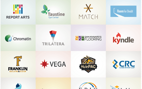
When creating a logo, you’re stuffing the entire story of a brand, along with all of its cultural and historical baggage into a small, distinct, and easy-to-decipher mark. Oh, and the connection needs to be instantaneous. No biggie.
It should be fairly obvious what you do, but it’s a given that you don’t have the monopoly on your market. So how do you guarantee you win out when your customers make an apples-to-apples assessment of their choices? Keep it simple, and remember that uniqueness isn’t optional.
It’s not about content, where you’re forcing every aspect of your brand into a logo, or listing all of your services. Framing your brand in the right context will make their choice crystal clear. It’s not that the audience connects, it’s how they connect.
When creating a company’s visual identity, it is crucial to consider the following basic questions:
Does your brand have a history?
Think of this more like a Carfax, and less like interrogating your date. If you’ve lived with your brand for a long time, how has it been received? Do people already recognize your mark, tagline, or some other brand element? If there’s something people love and accept about your brand, how can we cultivate that? If they absolutely hate something, how can we ditch it in favor of something better, or is it time to start from scratch? Sometimes there is no pre-existing brand, and that’s OK too. Not everything should revolve around history, but it’s a good place to start.
What do you want people to feel? Branding should always evoke some sort of emotion. Does your brand make people feel safe, empowered, comfortable, confident or happy? Does it make them think of their dog? Their baby? Their grandpa? Graphics, fonts, colors and the written word all carry immense power that affects our emotions in very interesting ways. What do you want your brand to communicate, and can you deliver on those promises?
Should your logo utilize graphics, type, or both?
When you say “logo,” people usually think of an icon or picture. A picture says a thousand words, however sometimes you only need one or two. It is common for clients to want to hold their audience’s hands, cramming a logo full of descriptive words, extra elements, and lengthy taglines. Graphic design at its core is visual problem solving, and giving just the right amount of information in a logo without over complicating things is one of the most important challenges that designers face.
If there is a graphic, is it literal or abstract?
If a mark is a quick read, it’s possible to tell a long, rich and complex story with one strong graphic. That being said, it has to make sense to the vast majority of your audience to be successful. A great literal mark serves to give the audience everything they need to know what you’re offering quickly and without the need for further explanation or exploration. A great abstract mark should clearly communicate a base-level emotion through shape and form, color, repetition or arrangement, and then let the brain fill in the blanks. Having confidence that your audience will “get it” can be a little daunting, but the payoff of gently guiding people to develop feelings toward your brand, rather than putting all of your cards on the table with a literal mark, can be extremely rewarding.
What color(s) are you going to use?
Color is important to our brains. We can recognize color and assign an emotional value faster than we can recognize a face and give it a name. When it comes to establishing a connection with an audience and setting your brand apart from competitors, lead with color.
Remember, it’s all about context. You may have skimmed over some of the content above, and that’s okay. The important thing is that if you’re still reading, you probably felt something. Maybe you’re realizing that clip art isn’t doing your brand justice, or that people have no idea how great your company is (their mistake). Let’s talk it out and see if we can take your brand to the next level.

