When It’s Not Enough to Follow, Lead

Overview
When David Novak (Former Chairman and CEO of YUM! Brands) and his team decided it was time to take the leadership lessons they perfected at YUM! around “Recognition” and turn them into a guided learning experience, they turned to OOHology. His goal was to engage young professionals and mid-level managers wanting to elevate their leadership game and prepare them for the responsibilities and challenges that come with more significant roles and titles. The key piece to that goal, engage.

The Challenge
If you want something done right…
When David approached OOHology to create the platform to support his vision, we assumed our focus would be primarily on crafting content for the courseware and creating outstanding design and video effects. We assumed the architecture for the LMS (Learning Management System) already existed and could be taken off-the-shelf to serve our needs efficiently. We were wrong.
We evaluated the 25 major contenders in the LMS marketplace and numerous smaller ones, hoping to whittle it down to 15 candidates, but none fit our needs or provided the engagement we desired. Almost universally, the LMS solutions available focus heavily on grading, scoring and SCORM compliance, a standard for web-based educational systems. These are all musts for teachers and educational institutions where a grade is an inherent part of the outcome. However, oGoLead's training is much more self-guided and heavily slanted towards student reflection and journaling. It’s experiential learning in a free-form engagement, not listen and regurgitate. These platforms didn’t deliver.
With these results in hand, we presented the top three contenders to the oGoLead Team and explained our findings. We also proposed a radical solution.
The Solution
Create a wholly new learning platform that correctly addresses the demographics and expectations of the target audience. This construct would be something entirely different delivering a wildly compelling experience for the users, and familiar, natural experience for young millennial professionals. Our platform will delight them and make them "feel at home" because our system will mimic the attributes of so many social media platforms today.

Home Sweet Home
Using Familiar Patterns
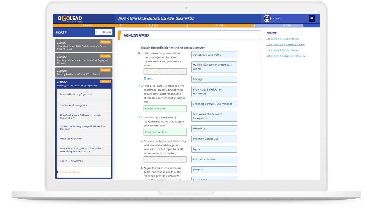
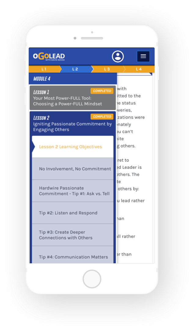
Good user experience is one where the user understands what to do without having to be taught. We emulated the social networks, capturing the personalized experience with familiar communication tools that match their expectations for engagement. From their profile pages to common notifications and messaging systems, we designed a platform that met their expectations. Courseware content is taken out of the long-form lecture and presented much like a news feed with distinct posts and bite-sized portions of topics called “cards.” Students can scroll through, able to pause and interact with elements interesting to them and perform “gated” experiences where specific activities and actions take place to progress through the course. And of course, it's entirely 100% adaptive and responsive, all the way down to phone-sized screens.
The Atomic Structure of a Course
With any content-rich platform, taxonomy and organization are critical to satisfying the user experience.
Highly Customizable Content
Anatomy of a Card
The creation of the card system for oGoLead was a significant breakthrough. The power of the customizable content cards and their flexibility lets oGoLead shuffle (pun intended) the deck of the course construction in real-time to keep things fresh and relevant. That’s the magic to keeping users engaged, therefore improving their overall experience.
- Each card would have a flexible layout allowing any number of one or two column rows (cells)
- Each cell could have one of the numerous types of content: copy, audio player, video player, photos with animations and easily selected effects and of course opportunities for reflection, answers, and journaling.
- Each card would also have comments and replies so that both the students and the administrators could flesh out the courseware over time with additional thoughts, comments, and discussion.
- Wayfinding techniques including subtle progress bars, color-coded status indicators and pop-up Tool Tips.
- A custom "courseware navigator" to make it easy for administrators to add/edit/remove content and new courses over time, without any further intervention or help from us.
-
Imageswith easily assigned reveal animations
-
Video Embeddingembedded content from YouTube or Vimeo APIs
-
Pull Quoteswith custom avatars for citations
-
Audio Embeddingpowered by the SoundCloud API
-
Sliding Scale Promptscustomizable ranges with dependent results
-
Date Promptssends reminders via notifications and email
-
Drag and Drop Sortingrank items with the ease of drag and drop
-
Drag and Drop Matchinginteractive matching prompt with hints
-
Various Quiz Typesengages the user with a variety of prompts
That’s not all
Sure we could have stopped there. But that’s not our way.
In typical OOH fashion, it’s not enough to build something to run, you have to want to drive it every day, and that means bells, whistles and dynamic features that delight the user. So if they fit, we put them in.
-
Moderated discussion threads for each card
-
Interactive searchable journal
-
Scheduling activity reminders and notifications
-
Interactive CMS Course Navigator for designing courses
-
E-comm market place
-
Custom theming
-
Custom course completion certificates and social sharing
-
Interactive elements and customizable “connecting points”
-
Ebook purchasing

The Result?
Careful what you build. Soon everybody will want one.
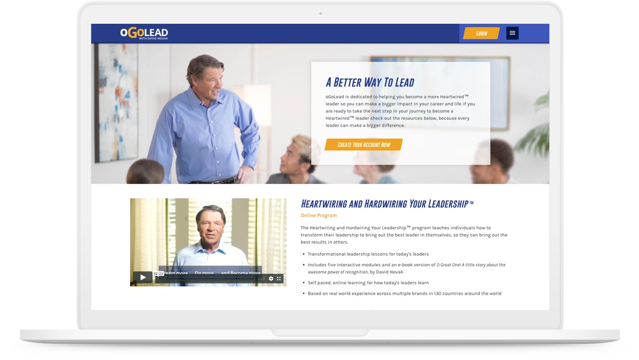
The final result is a courseware solution with a world-class interface that is modern, relevant and easy to use for both administrators and students.
Since the launch of www.ogolead.com (the public-facing marketing site) and learn.ogolead.com (the e-com and courseware platform), we've gone on to add new affiliate sales models and "bulk" corporate sales models to the solution. And oGo is getting intense interest in the platform itself, so a new spinoff might well offer up the platform to other content creators and organizations in the near future.