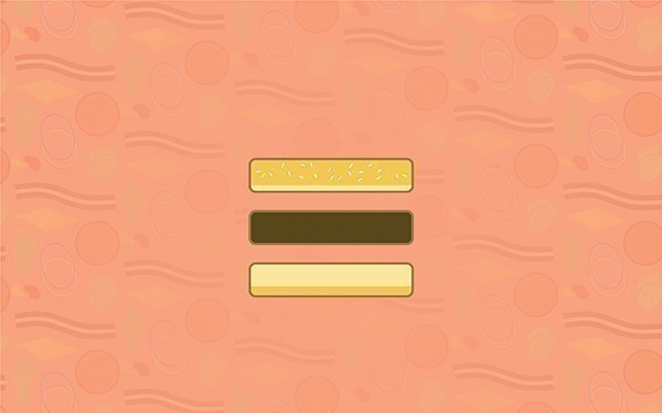
The average American consumes eleven hamburgers per day.
Put down the knife (and fork. You do eat a hamburger with utensils, right?) I’m not talking about a juicy patty of meaty deliciousness. I’m talking about the user interface hamburger. Whether you know it by that name or not, it’s been helping you consume the web better for years. As mobile overtakes the desktop as the most popular way to access the web, its value is only going to grow.
The hamburger is the name of the three little horizontal lines in the top-right corner of your favorite mobile site experience. Back in 1981 the Xerox Star’s UI became the first to employ the mighty hamburger. The icon didn’t really gain much ground until around 2007 with the insurgence of smartphones.
As the treatment gained momentum, its variations — with dots and variable length lines — faded in favor of what has now become ubiquitous: three horizontal lines of equal length and spacing. It takes a bit of imagination to picture it as a hamburger, but a few developers did. No particular person is credited with the name "hamburger menu," but it’s become a common term in the digital world.
As responsive web design becomes more prevalent, many websites have started using list icons to replace a traditional set of navigation links altogether.
So, back to the stats.
The average user views around 90 sites per day according to Pew Research. A growing 13 percent or so of current websites are responsive, based on various tests and datasets. That means we're looking at a whopping 11.7 hamburgers per day.
Just like the spread of the Big Mac to 35,000 McDonalds franchises worldwide, the hamburger menu is crossing cultures, finding its way to desktop experiences as well. Check out popular sites like The New York Times, Slate and Upworthy, all proudly displaying their menus with the UI minimalist's favorite morsel.
I’ve got a hunch why news sites were among the first to embrace the hamburger. The whole point of a news site is to deliver a continuous stream of fresh content. Users want to be able to access that content without poking around the navigation forever. Then again, isn’t that the same experience we’re all seeking, on any website? Give us relevant content up front. Don’t make us dig for it.
A large navigation is a poor substitute for a well-guided UX, created as a fallback for users who feel forced to find their own way. Targeted, relevant content presentation allows us to shrink the real estate devoted to navigation.
We've got a ways to go before the hamburger replaces the standard nav at the top of the UI food chain. For now, there's nothing holding responsive websites back from using both methods interchangeably. I predict this beefy little icon will gain ground for many years to come.

