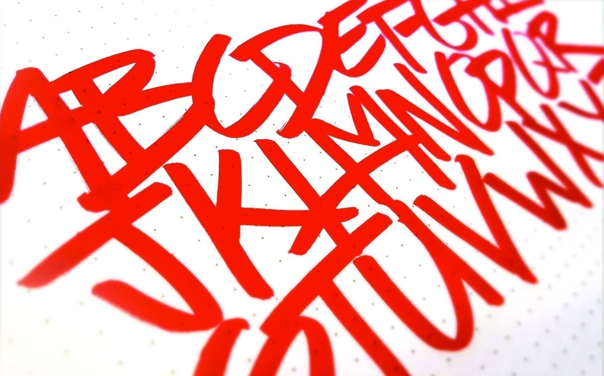
In the highly usable land of modern, flat design, many paths lead to the same place. An abstract geometric logo is right for a lot of businesses. It has an air of efficiency and professionalism, but can often look cold, or lacking in personality. Some businesses do need a more graphic representation. But some, well, they need a more old-school flair.

When you want to put a little paprika on your highly usable, flat, design without sacrificing its clean aesthetic, you can do that with a hand-lettered, brush pen logo. In this first part in a series of blogs, I will teach you to go from “bad” to “kind of alright” at hand lettering. The rest will be up to you and the amount of dedication and practice you put into it. In the series, I’ll go over techniques (both digital and traditional), theory, inspiration, drills, and equipment. Or at least my take on them.

But hold on. Let’s take baby steps. Measure twice and eff up less, as they say. Let’s take a look at some really solid penmanship so we know what we’re shooting for.
To begin learning to hand letter, you will need:
Pens
The brush pens I most commonly use are Tombow Dual Brush Pens. These are brush tipped markers, and I feel most consistent with my lettering when I use these tools. Marker tips are less flexible than traditional brush tips, which make them easier to control, but it does diminish the range of line width. (A fantastic guide has already been written, so I won’t get too detailed here. You can read it for more information on choosing a brush pen.)
Paper
Brush tips eventually wear out due to their malleable nature: The hairs on bristle tipped brush pens eventually fray and felt marker tips bend, distort, and shear. This fraying and shearing is going to make your lines look crappy after time. The best way to get the longest lifespan out of your pens is to work on the correct surface. Toothy paper can be right for some projects, but brush tips work best on smooth paper. I’m really partial to Rhodia’s Dot Pad. It’s smooth but not overly so, which lets the marker perform but also allows the ink to dry quickly. Also it has a nifty grid of dots to help you layout, but is less obtrusive than a lined grid.

A Technique Primer
Lets look at the example of Mint, above. I’ve hit it with a little Aquafresh to illustrate some points. I’ve noted the downstrokes in red and the upstrokes in blue to show you how simple the basic technique is. Repeat after me, “Heavy downstrokes and light upstrokes. Heavy downstrokes and light upstrokes. Heavy downstrokes and light upstrokes.” There’s an adage, the 80–20 rule, which says “20 percent of the effort makes 80 percent of the effect.” Typically, in design, it’s said disparagingly about rough work, but let's be pragmatic here. We’ve just uncovered one simple concept that takes you almost all the way, is easy to grasp, but takes focus and practice to master.

Your First Exercise: Minimum
Writing must be confident and quickly written to achieve fluidity. This kind of skill requires muscle memory. To be able to thoughtlessly execute with precision should be your goal. Let’s examine the word “minimum.”
What you’ll notice from watching me write this word is how much repetition it takes. The pen is constantly moving up and down and always weighted on the downstrokes and lightened on the upstroke. This is a great practice word.
ABC Drills
You won’t always be writing the word “minimum,” so it’s probably a good idea to get the other letters of the alphabet under your belt as well. Don’t overthink it, just write all the letters. Losing focus of the word lets you focus on your technique.
I try to do these at least once a day, but I’ve found that I sometimes don’t get all the way to “z” and my technique on the last half of the alphabet is weaker as a result. To compensate, I’ve started to practice writing them in reverse. Be watchful of your progress or you’ll develop this same bad habit.
P.S. Get Hype if You Wanna Get Good
There are many different styles of hand lettering. Below, I’ve listed a few great communities that will inspire you. Just copy these guys. If you have trouble with a particular letter form, Google it, copy it, become competent at repeating it, and after that, make it your own. Because there’s nothing wrong with plagiarism if it can’t be proven in court.

