Here’s a nasty secret that no one wants you to know: Anyone can be a good photographer.
With the perfect setting and location, ideal lighting, professional models and an expensive camera set to AUTO mode, literally anyone can take a decent picture. What sets a great photographer apart is the ability to take a jacked up scene and transform it into a magical wonderland for the viewer. That’s real skill.
The muscle behind the photo magic is in practice and training your eye. A truly skilled photographer can find ways to make ordinary settings look extraordinary for the audience, so that was the challenge we set for ourselves. Art Director Katie McBroom and Assistant Art Director Lydia Tissandier took a field trip to the floral aisle of a local craft store to prove that inexpensive props, terrible lighting and amateur models can still turn out haute photography when a skilled photographer is behind the lens.
Let’s zoom in (yeah, we said it) on what we learned!
If you’re stuck with a flat background and no depth, utilizing some fake layering will help create visual interest and give the illusion that you’re in a dense, ethereal place. Even though Karen just mean-mugged you because you’re in Aisle 7 and she’s trying to sweep up before close. One way to create artificial depth through layering is by dangling a little bit of something right in front of the camera. It’ll be out of focus and add just enough visual texture to give a dreamy, dimensional depth to a shot that would have otherwise been very flat. Another tactic you could use would be to go for angles. While your background may be flat, moving the the side of your subject versus straight on can give you a world of intensity that you couldn’t get from straight on.
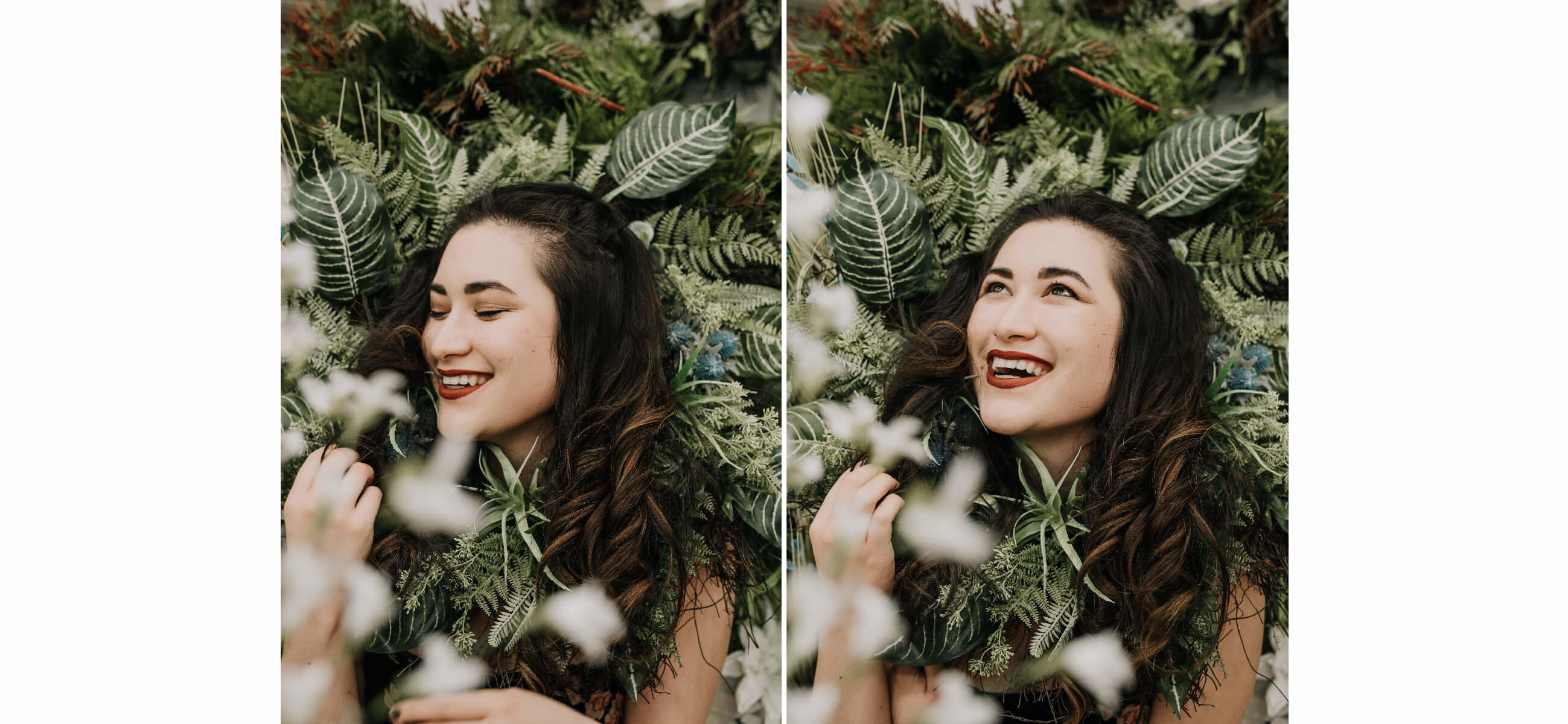
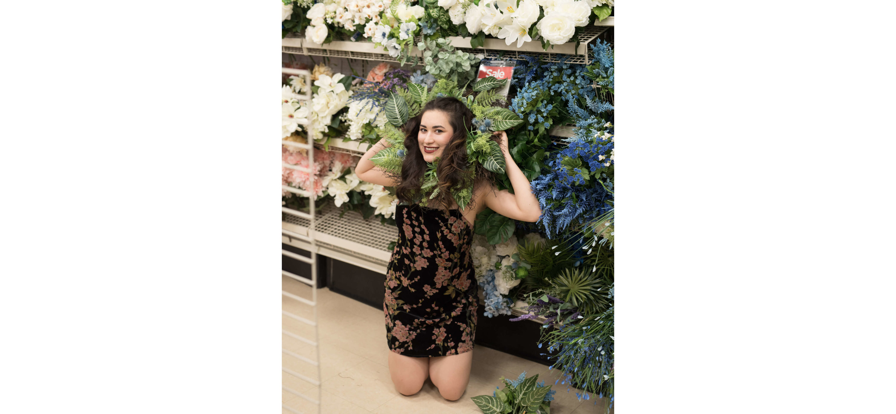
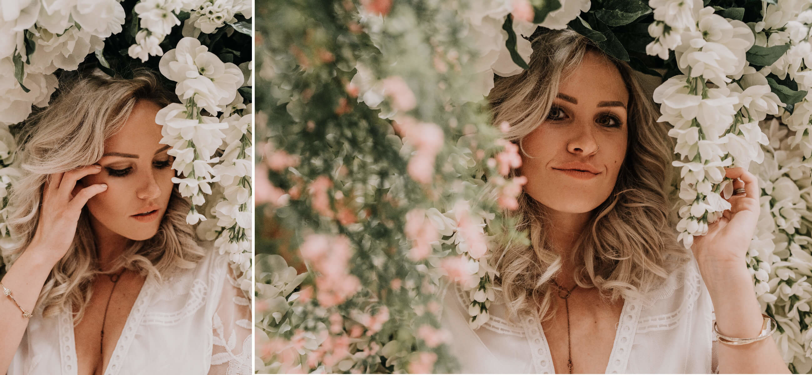
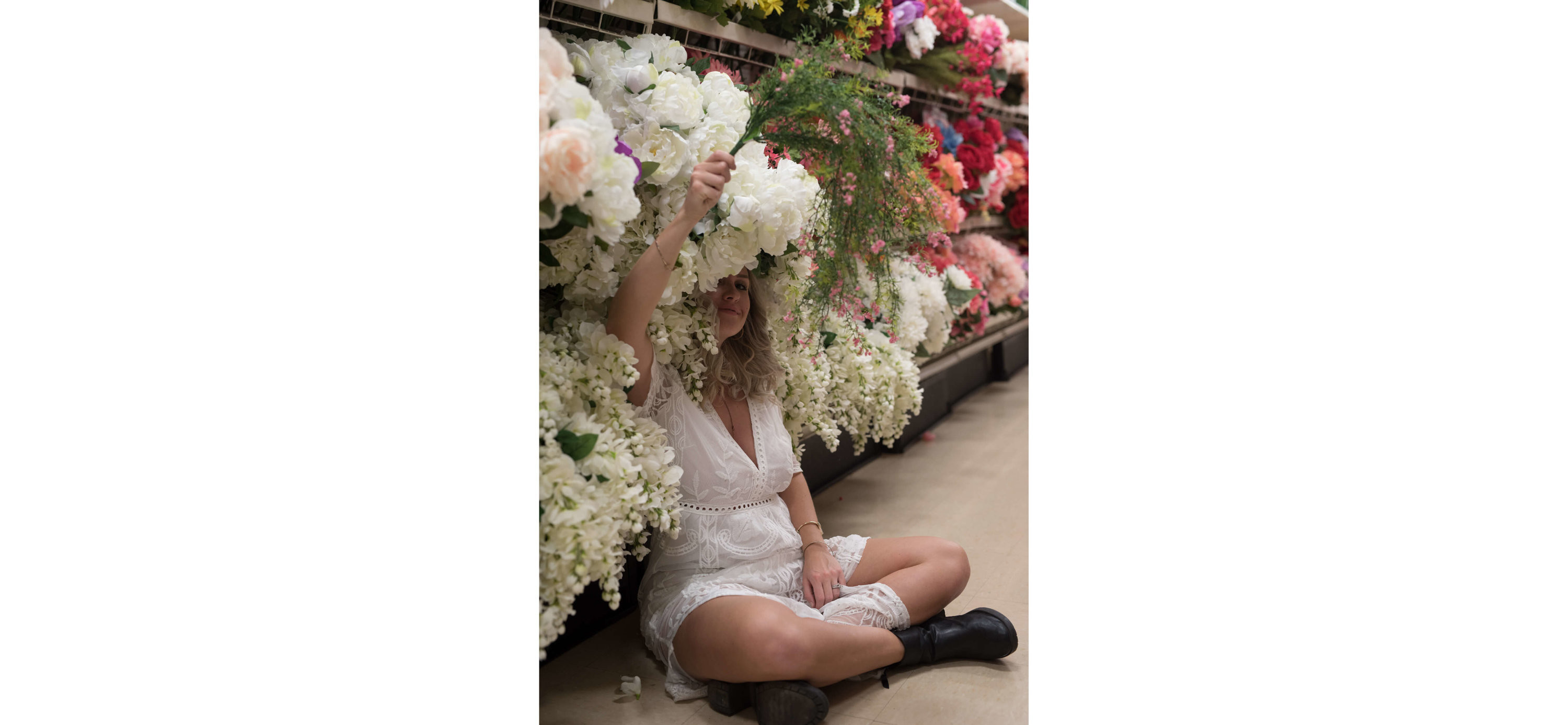
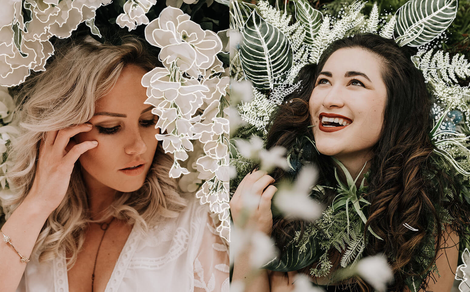
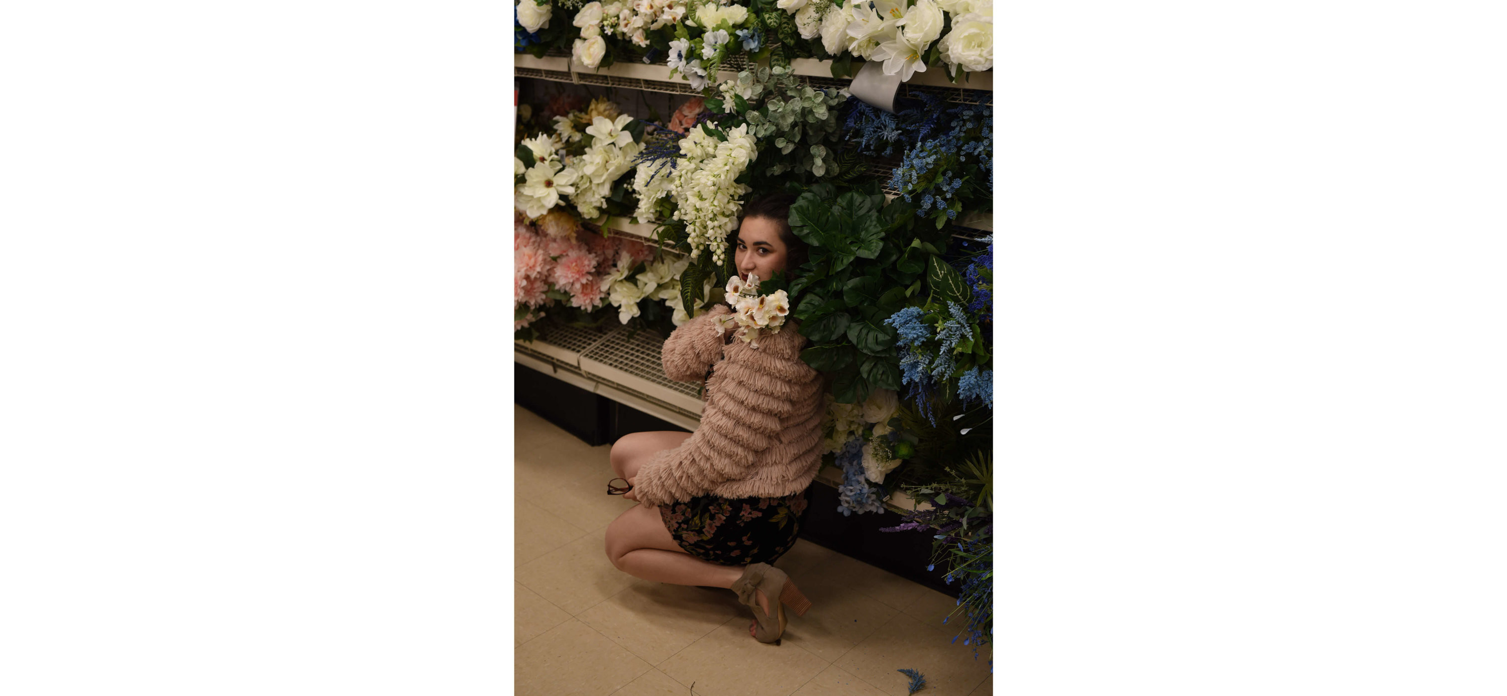
While layering can help add a little touch to upgrade your shot to the next level, composition is a critical photography element that can actually make or break your shot. Every photographer knows the easy parts of composition: don’t cut off the top of Uncle Harry’s head, don’t hold the camera crooked, and make sure your subject is in focus. For this challenging shot, we used the exclusion element of composition to carefully edit what is in the frame. You have to look through the lens and think, Would anything about this composition give it away that I’m in Aisle 7 and not in Wonderland? It’s easy to discount locations, but if you get granular with your composition, you can make nearly any setting viable. Crop out the shelving and sales tags and suddenly Aisle 7 is an amazing jungle.
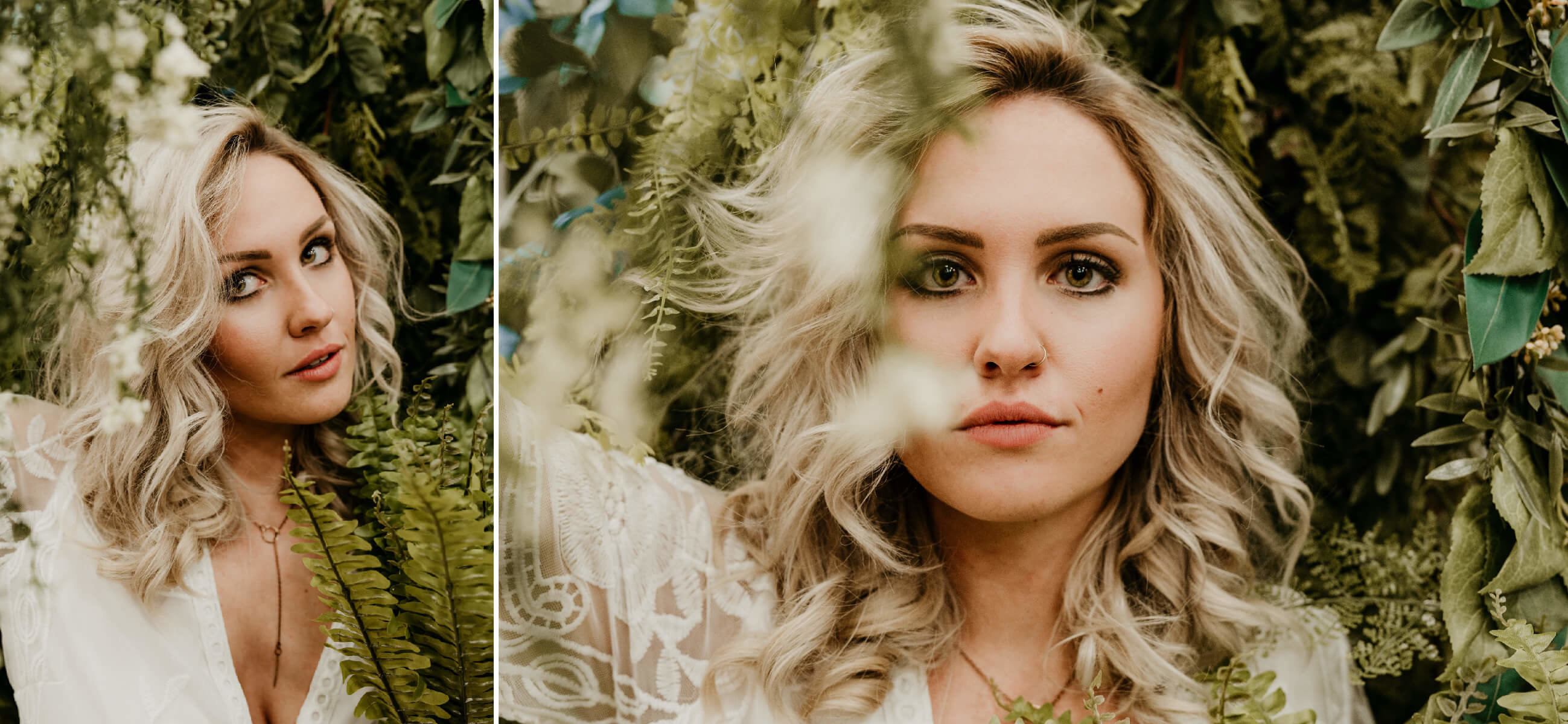
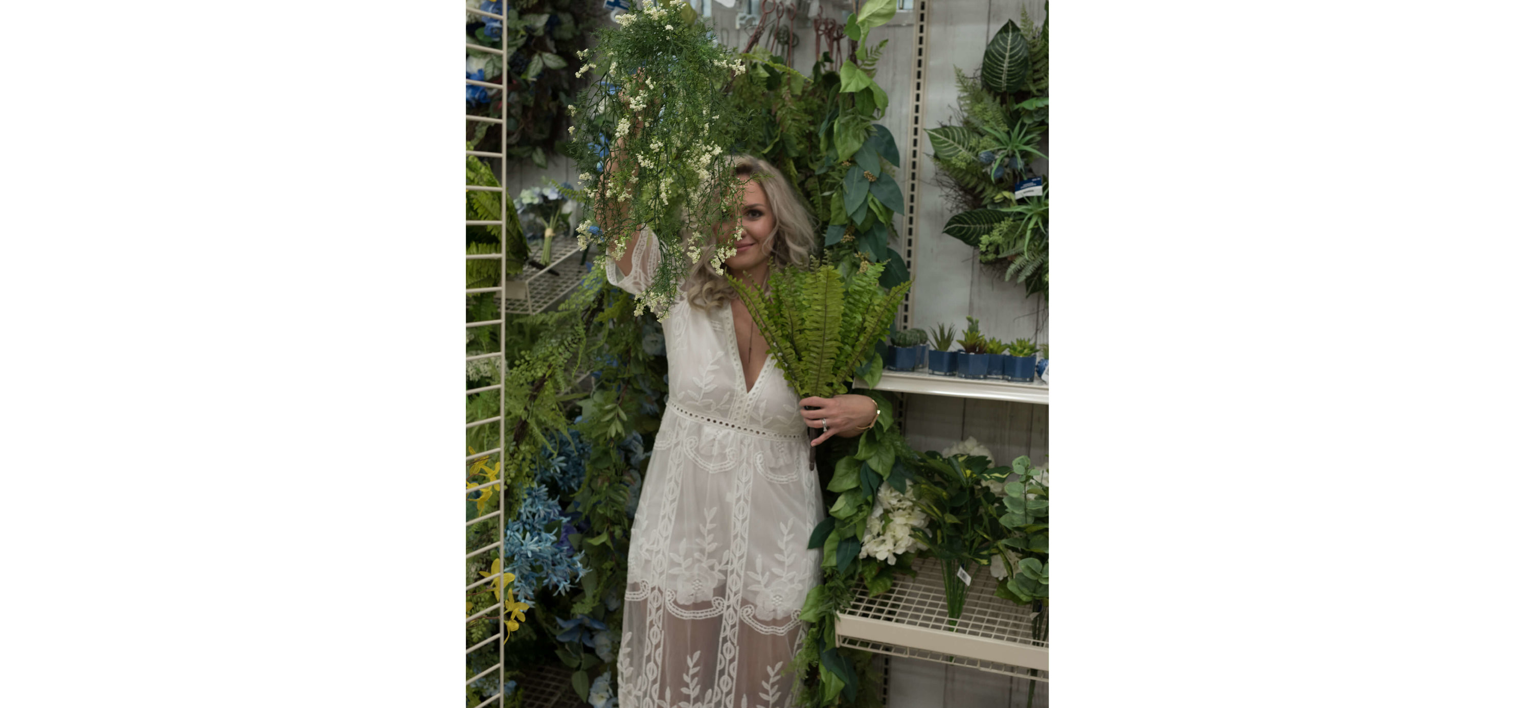
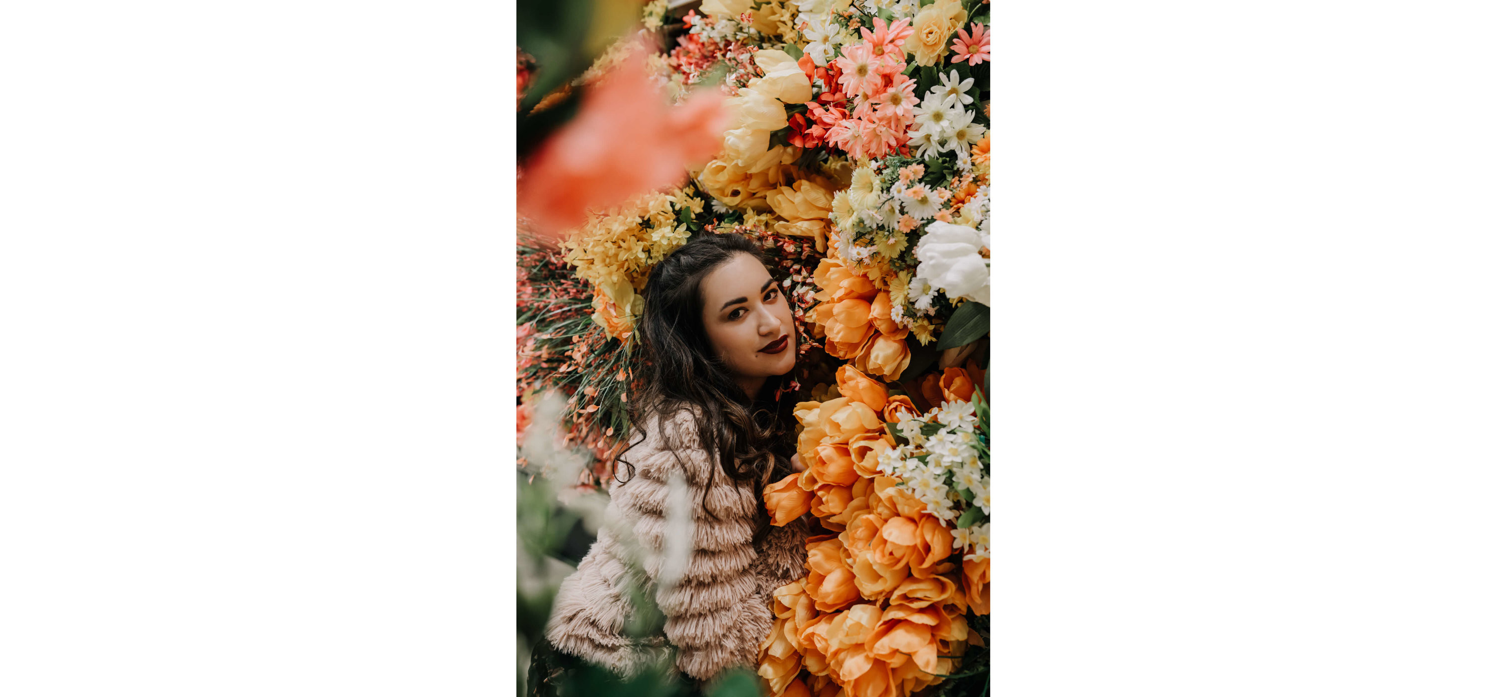
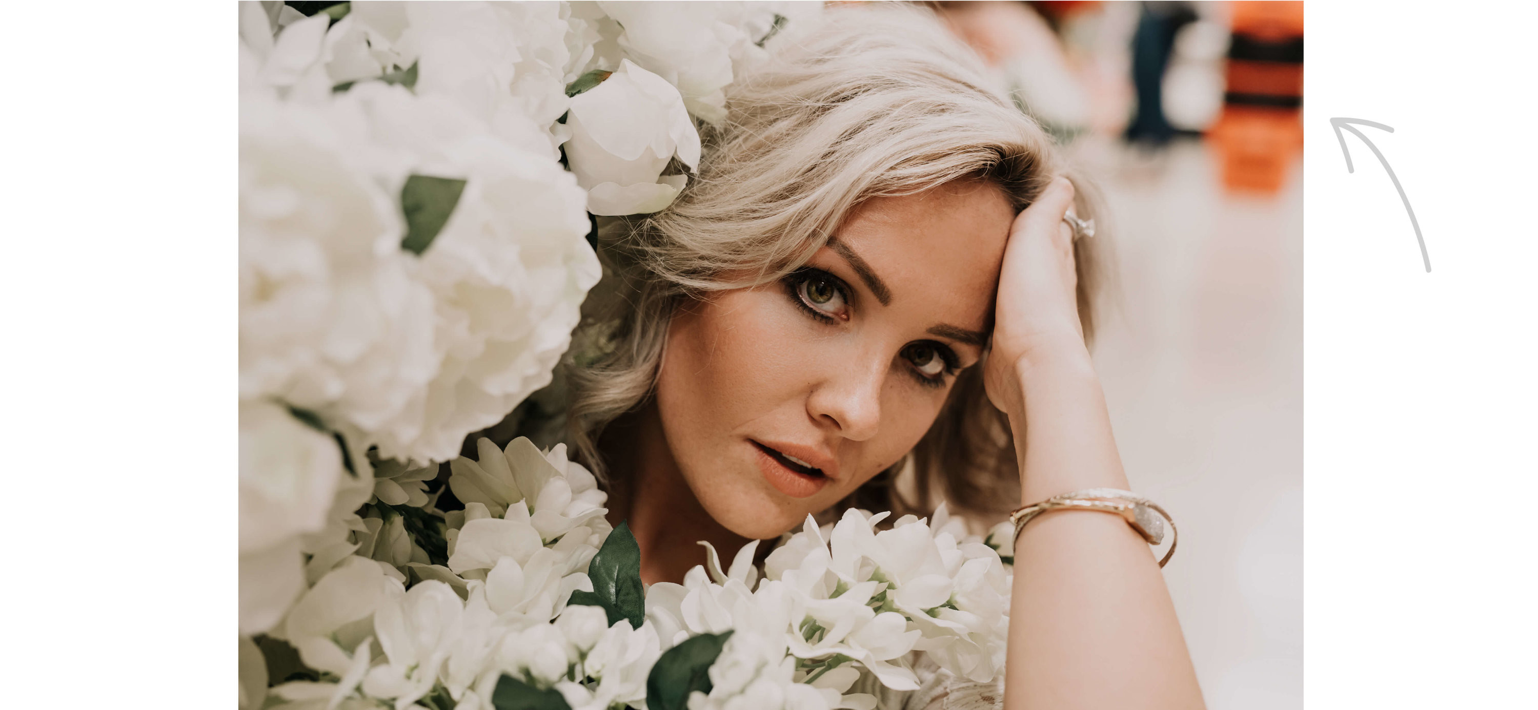
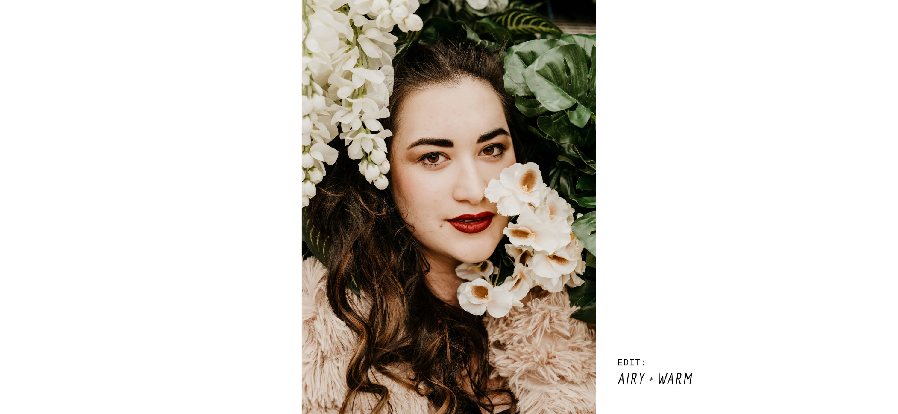
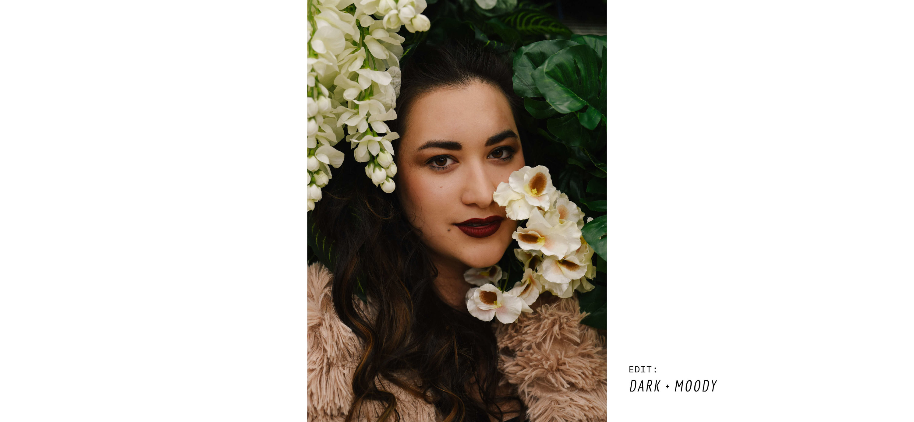
No matter how diligently we try to compose our shots, sometimes annoying little giveaways creep into our frames. Photographers have to move quickly and stay on top of a million things, and it’s easy to miss the red shopping cart that has crept into your composition. This is where toning and editing come in to save the day. Toning a photo dramatically alters the mood––is this picture bright and airy or dark and dramatic? If you shoot RAW (which you should), you have total control to change this through toning, and to downplay any rogue tones that are coming through and killing your vibe.
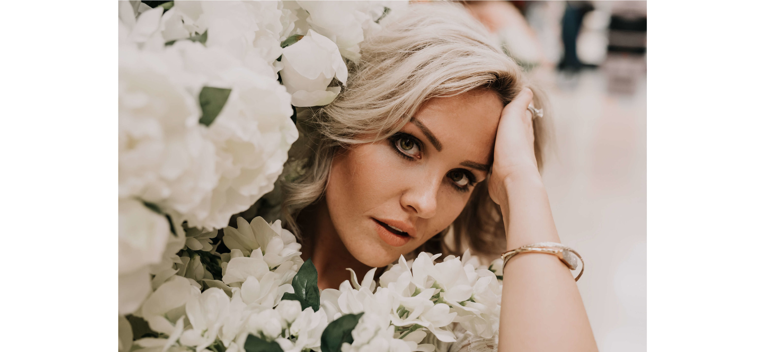
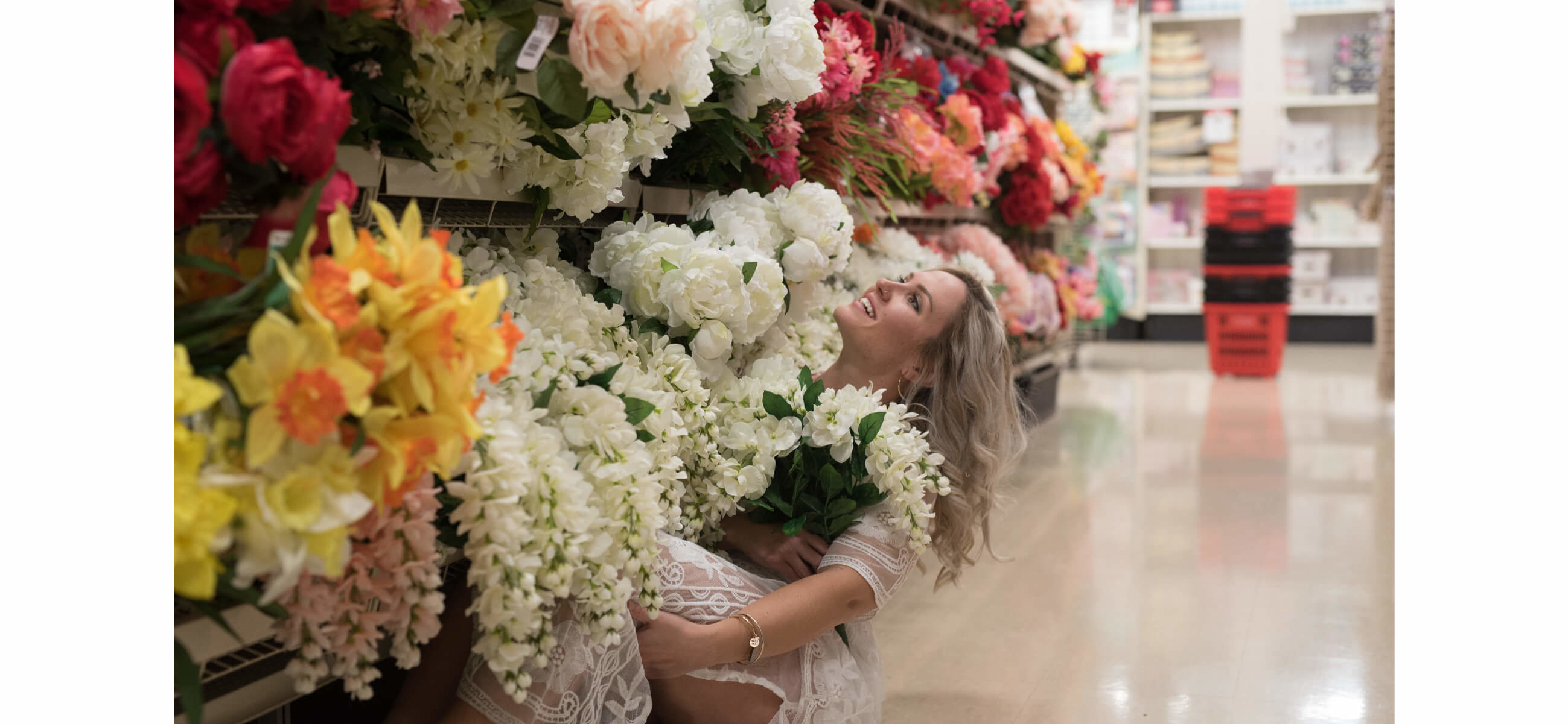
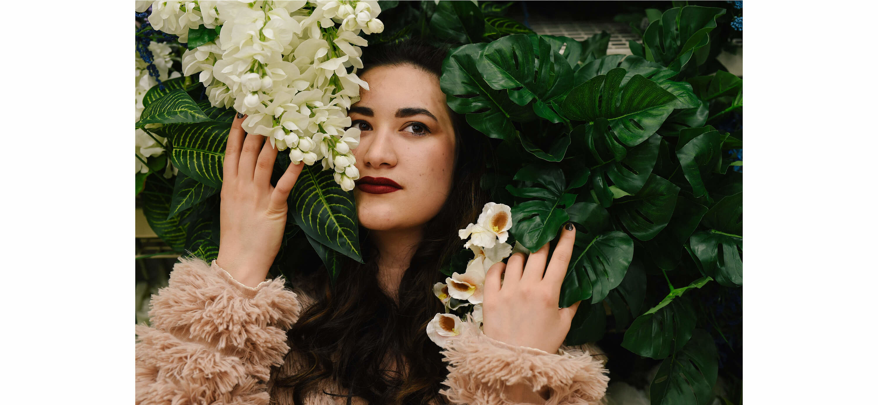
Unlike toning, lighting is nearly impossible to edit. There are a ton of different lighting techniques that all create different moods, but you should always shoot for smooth, well-lit, even lighting across a portrait. Unless you’re going for some edgy drama, in which case, you do you, boo. In some of our challenge shots, we were too deep in the flowers, causing them to be bright and the portraits to be too dark. In other frames we were right under the bright overhead light, creating wonky and uneven shadows. You have to get the lighting right––even when it’s as wrong as fluorescent light bars.
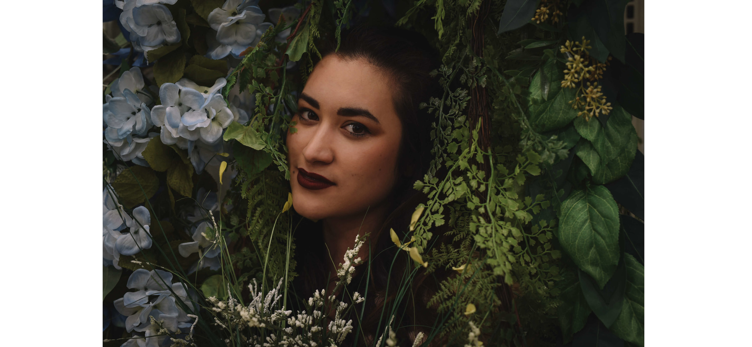
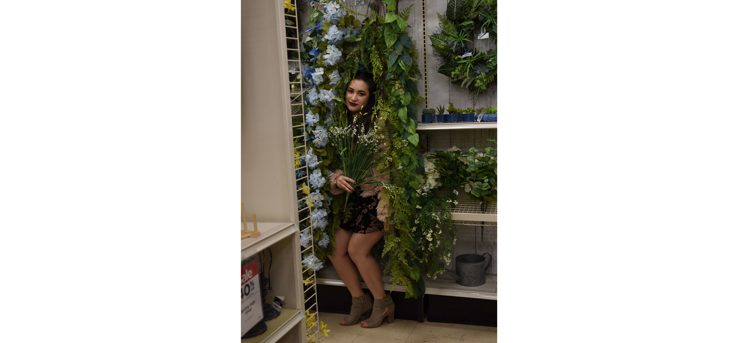
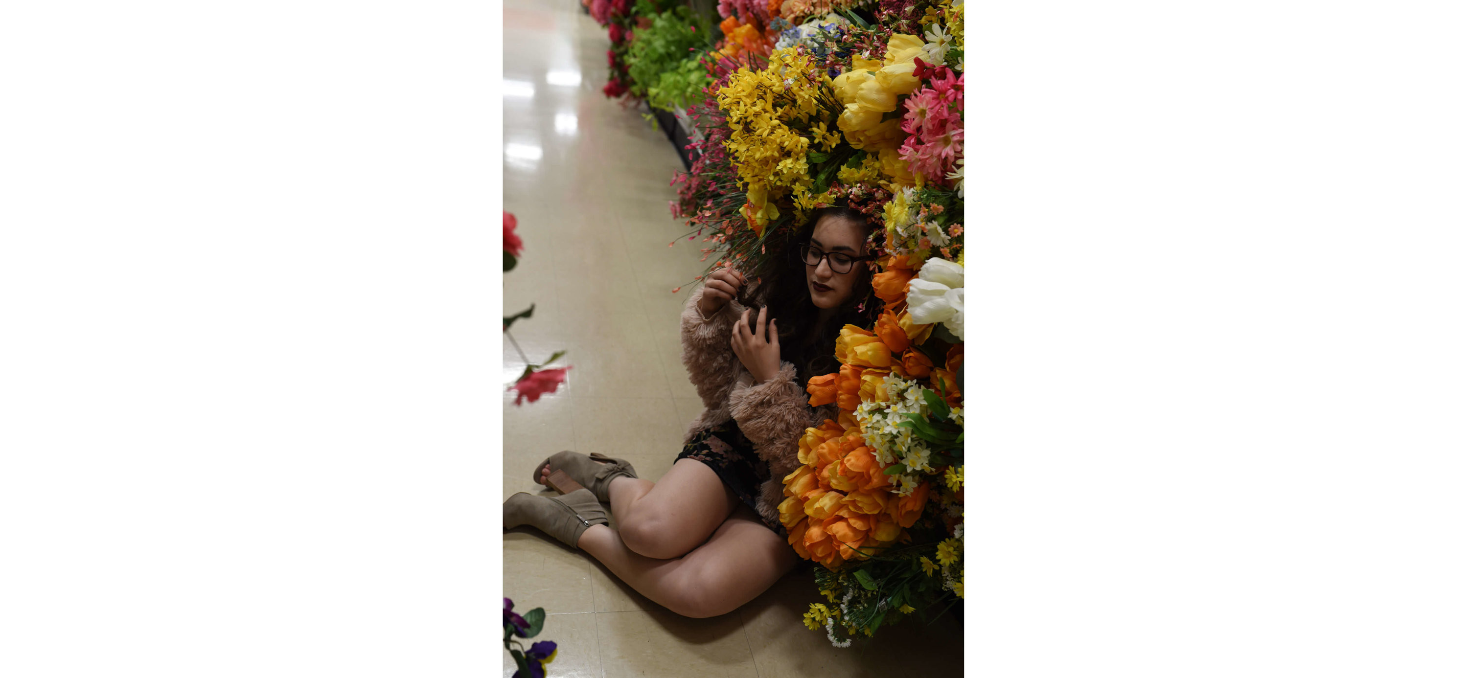
One of the final elements that can help to make a great photo in dire settings is context. This is almost the flip-side of composition. When we touched on composition, we talked about cropping out and excluding things we didn’t want the viewer to see. With context, we want to be sure we show them enough of what we do want them to see. For example, this photo makes Katie look like a floral version of the sun on teletubbies because we didn’t get enough of the subject in the shot.
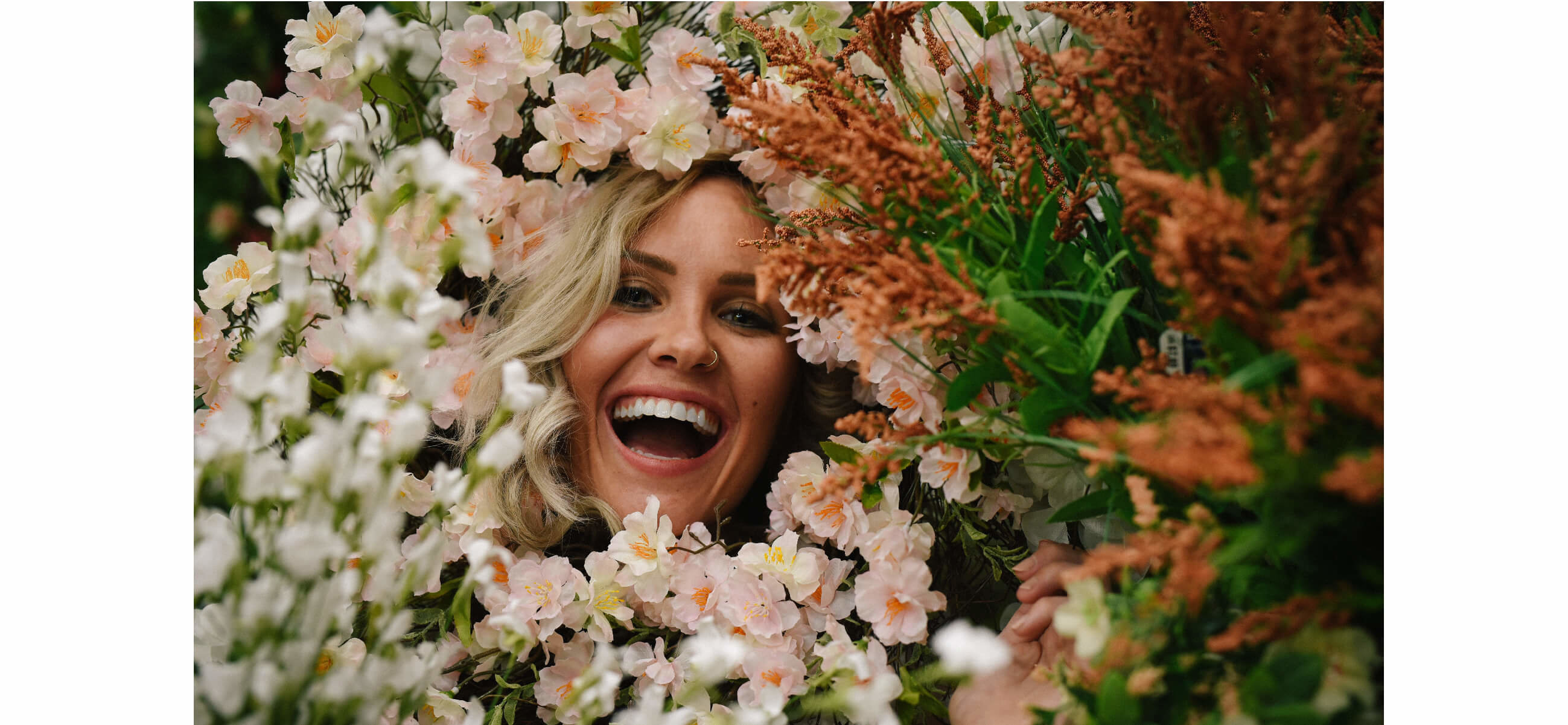
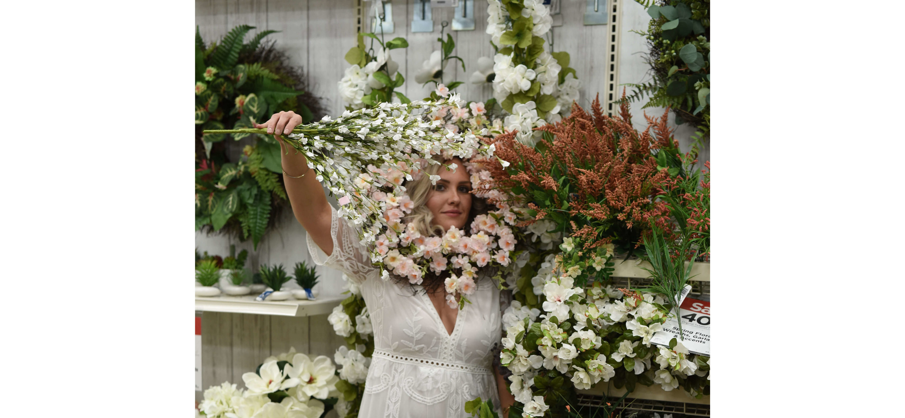
Lastly, one of the most critical elements of a good photo is having some glam, bomb-talented models with a little bit of free time and weird ideas about what “fun” is after-hours on a Tuesday.

